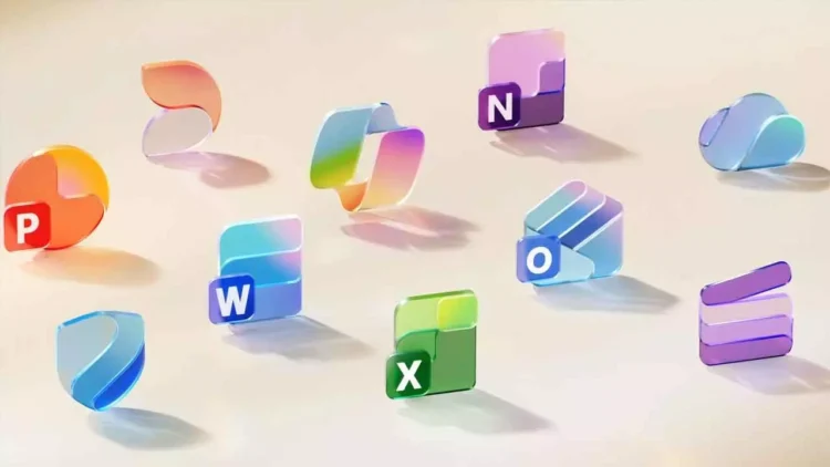
Microsoft has refreshed the appearance of its iconic Office suite. The company revealed redesigned icons for all 10 core Office applications, marking the first significant update since 2018. The new icons are more vibrant, playful, and modern, embodying Microsoft’s broader design philosophy with Fluent illustrations and the recent Copilot icon. Each icon now features richer gradients and enhanced contrast, improving accessibility and creating a more cohesive design language across Microsoft 365.
Jon Friedman, corporate vice president of design and research for Microsoft 365, noted, “The core 10 Office apps were last updated in 2018, and the language we used to describe the designs remains relevant today: connection, coherence, seamless collaboration, fluid transitions.” He added, “The new icons radiate fluidity and playfulness while being simpler, more intuitive, and highly accessible.” Friedman explained that while gradients were previously subtle, they are now richer and more vibrant, with pronounced analogous transitions that enhance contrast and accessibility. The redesign emphasizes simplification for clarity at smaller sizes; for example, the Word icon has changed from four horizontal bars to three. “We’ve transitioned from bold, static solidity to softer, more fluid forms,” Friedman stated.
“Sharp edges and crisp lines have been replaced by smooth folds and curves, imparting a sense of playful motion and approachability to the icons.” Microsoft announced that the updated icons will begin rolling out in the upcoming weeks across web, desktop, and mobile platforms for both consumer and business users. This refresh not only modernizes Office’s visual identity but also aligns it with the evolving design standards of Microsoft 365.


